Hey there, dev! If you’ve been writing with HTML and CSS for a couple of years now, but find yourself hand-writing endless class names, worrying about cross-device compatibility, or longing for a speedier workflow, you’re not alone. Chances are you’ve developed a love-hate relationship with styling.
Sure, CSS gives you full control, no doubt, but it can also get messy fast. You might find yourself juggling multiple .css files, hunting down class selectors, or fighting specificity wars you never wanted to be in.
I remember my early days with HTML and CSS; crafting beautiful pages from scratch felt empowering, but maintaining them? Not so much. I remember juggling media queries, custom classes, fighting specificity issues, and my stylesheet had a 200+ line code for a single element.
Do you know you can actually write small, reusable utility classes? Something like bg-blue-500, p-5, or flex. Instead of writing long custom CSS files and you can actually build directly in your HTML. But before we get into Tailwind CSS, let’s understand what a CSS framework is about and some well-known CSS frameworks.
What is CSS Framework?
CSS frameworks are like toolkits for making websites look good without having to start from scratch. They have ready-to-use styles and layouts so you can put together a webpage faster. You get a bunch of design bits and pieces like buttons, menus, or ways to arrange things on the page.
Some well-known CSS frameworks include:
- Bootstrap: Very popular and comes with lots of ready-made parts for different parts of a website. It’s especially beneficial for ensuring your site works well on both phones and computers.
- Tailwind CSS: This one is all about giving you little bits of design that you can mix how you want. It’s great for making something unique without having to write a lot of code.
- Bulma: Known for being easy to use and focusing on how things look on different screen sizes. It’s free and has a lot of basic design tools.
- Foundation: This one’s great for making sites that need to work well on mobile right out of the gate. It has lots of features for building more complex sites too.
- Material Design: Google made this one for making interfaces that look modern and clean. It has a lot of guidelines for animations, layouts, and how things should look.
Frameworks help make web development faster because they have a lot of the common design stuff already figured out. Some are more about giving you ready-made pieces, while others let you customize more.
Traditional Frameworks vs. Utility-First
There are two main kinds of CSS frameworks:
- Traditional frameworks like Bootstrap give you components like buttons or menus that you just put into your site. They’re quick at making simple sites but can be a bit limiting if you want something very specific.
- Utility-first frameworks like Tailwind CSS give you lots of small design choices that you can put together in different ways. This means you can make your site look exactly how you want, but it might take more time to figure out.
Here’s how they stack up:
- Speed: Traditional ones get you going faster, but utility-first can be quicker once you know what you’re doing.
- Flexibility: Utility-first gives you more freedom to make your site look unique. Traditional ones have set styles that might not fit every idea.
- Consistency: Both types help keep your site looking consistent. Utility-first also makes sure you use the same design language throughout.
- Performance: Utility-first can be more efficient because it only uses the styles you need, but it might make your files bigger. Traditional frameworks come with extra stuff you might not use.
Choosing between them depends on what you need. For simple sites, traditional frameworks are great. If you’ve hesitated to try CSS frameworks, Tailwind’s flexibility and minimalism make it perfect for developers moving from vanilla CSS.
In this step-by-step responsive design tutorial, we’ll walk from Visual Studio Code setup all the way through Tailwind CSS installation, exploring core utilities like layout controls, color classes, and responsive breakpoints. By the end, you’ll be ready to style pages faster than ever without giving up precision or creativity.
Step 1: Visual Studio Code Setup (VS Code)
Before diving into Tailwind CSS installation, you’ll need a code editor that’s powerful, fast, and Tailwind-friendly. Visual Studio Code (VS Code) ticks all these boxes and more.
1.1 Downloading and Installing Visual Studio Code
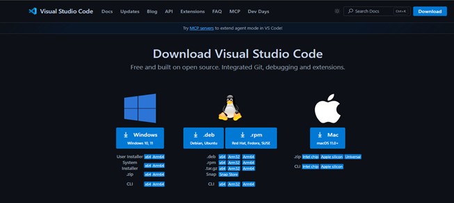
If you don’t already have VS Code, setting it up is straightforward:
- Download: Visit the official VS Code website.
- Choose your platform: Windows, macOS, or Linux. Click the appropriate download button.
- Install: Run the installer and follow on-screen prompts.
- Launch VS Code: Once installed, open the application from your desktop or start menu.
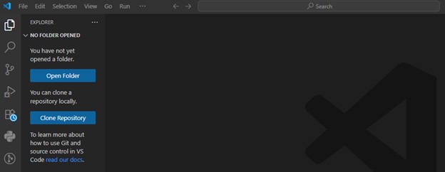
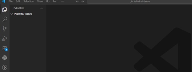
1.2 Opening VS Code for the First Time
When you launch VS Code, you’ll see a welcome screen with quick start options like “Open Folder” or “Clone Repository.”
For our Tailwind project, select Open Folder and create a new project directory, for example: tailwind-demo
1.3 Recommended Extensions for Tailwind
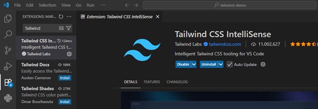
To make your Tailwind CSS journey smoother, install these extensions:
- Tailwind CSS IntelliSense: Adds autocomplete, syntax highlighting, and hover previews for Tailwind classes. Search “Tailwind CSS IntelliSense” in the Extensions panel (Ctrl+Shift+X / Cmd+Shift+X).
- Prettier – Code Formatter: Keeps your files neat and consistent.
- Live Server: Lets you see changes instantly in your browser as you edit files.
Step 2: Setting Up Tailwind CSS Installation
We’ll create a minimal project and integrate Tailwind from scratch. As of 2024, Tailwind CSS recommends installing via npm for full customization and build-time optimization.
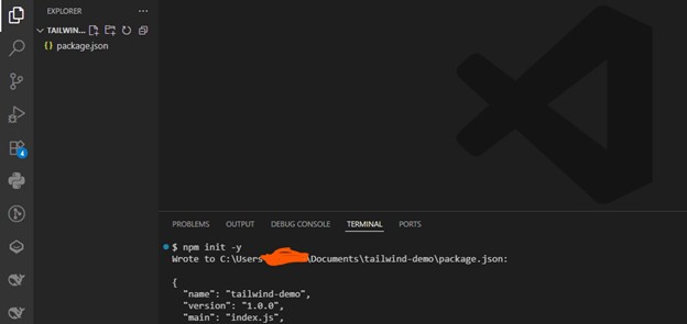
To keep things organized, start by creating a new project folder and initializing it:
- Open VS Code.
- Open a new terminal:
- View > Terminal or Ctrl + `
- Initialize a new npm project: npm init -y
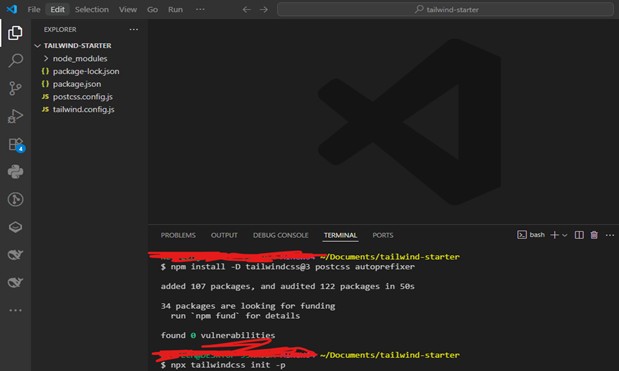
2.2 Install Tailwind CSS via NPM or CDN
- Run
Install Tailwind CSS and its dependencies: npm install -D tailwindcss@3 postcss autoprefixer
Create Tailwind and PostCSS config files: npx tailwindcss init -p
2.3 Configuring Tailwind: tailwind.config.js
This config file lets you customize Tailwind’s theme, colors, breakpoints, and more. For now, let’s make sure Tailwind scans the right files for class names.
- Open tailwind.config.js.
- Update the content array to match your project structure. For an HTML-based project:
module.exports = {
content: [“./src/**/*.{html,js}”],
theme: {
extend: {},
},
plugins: [],
}
This tells Tailwind to scan your HTML and JavaScript files for class names, so unused styles can be purged for a smaller CSS file.
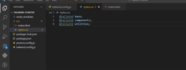
Adding Tailwind to Your CSS
In your project, create a src folder.
- mkdir src
- Inside src, create a file: styles.css.
- Add these Tailwind directives to your styles.css:
@tailwind base;
@tailwind components;
@tailwind utilities;
Build Tailwind CSS using CLI
Run this on your terminal
npx tailwindcss -i ./src/styles.css -o ./dist/styles.css –watch
This command takes your src/styles.css, processes it with Tailwind, and outputs the result to dist/styles.css, updating automatically as you code.
Add a build script to package.json:
“scripts”: {
“build”: “tailwindcss -i ./src/styles.css -o ./dist/styles.css”, “watch”: “tailwindcss -i ./src/styles.css -o ./dist/styles.css –watch”}
This means:
- Input: ./src/style.css (with Tailwind directives)
- Output: ./dist/output.css (compiled CSS)
- –watch: automatically rebuild on file changes
Link Compiled CSS in HTML
In your project root, create an index.html file and add this:
<!DOCTYPE html>
<html lang=”en”>
<head>
<meta charset=”UTF-8″>
<meta name=”viewport” content=”width=device-width, initial-scale=1.0″>
<title>Tailwind Demo</title>
<link rel=”stylesheet” href=”../dist/styles.css”>
</head>
<body class=”bg-gray-100 text-center p-10″>
<h1 class=”text-3xl font-bold text-blue-500″>Hello, Tailwind!</h1>
</body>
</html>
Run: npm run build
Core Concepts of Tailwind CSS
1. Utility-First Methodology
Tailwind CSS uses a special approach called “utility-first”, which is like giving you a bunch of small tools instead of a few big ones. For example, you can use bg-blue-500 to make the background blue, p-4 for padding, and font-bold for bold text. You mix and match these tools on your webpage elements to get the look you want. This way, you have total control over your design without being stuck with pre-made components.
Tailwind has hundreds of these tools for colors, spacing, typography, and more. It even takes care of making sure your site works well on different devices and browsers. Plus, you can easily change these settings in the tailwind.config.js file to match your style.
2. Responsive Design
Tailwind makes it super easy to design websites that look good on any device. It has special tools that only kick in at certain screen sizes, like md:text-lg for larger text on medium-sized screens. You can also add effects for when someone hovers over a button or focuses on an input field.
With Tailwind, you can build complex layouts and interactions right in your HTML, making things like dropdown menus and pop-ups a breeze. It’s packed with helpers for positioning, visibility, and creating modern, responsive designs.
Core Tailwind CSS Utility Classes
Now that our Tailwind CSS installation is complete, let’s explore its most useful utilities.
Layout Utilities: Flex, Grid, and Spacing
Flexbox
<div class=”flex justify-center items-center h-screen bg-gray-200″>
<p class=”text-lg”>Centered with Flexbox</p>
</div>
- flex → Activates flexbox
- justify-center → Horizontal centering
- items-center → Vertical centering
Grid
<div class=”grid grid-cols-3 gap-4″>
<div class=”bg-blue-200 p-4″>1</div>
<div class=”bg-blue-200 p-4″>2</div>
<div class=”bg-blue-200 p-4″>3</div>
</div>
- grid-cols-3 → 3 columns
- gap-4 → Uniform spacing
- bg-blue → Change Background and text color
Spacing
No need to write separate margin/padding rules:
- m-4 → Margin of 1rem
- p-6 → Padding of 1.5rem
- mt-8 → Margin-top of 2rem
Tailwind offers consistent scale: from p-1 (0.25rem) up to p-96 (24rem) and more.
Example
<button class=”bg-green-500 text-white px-6 py-3 rounded-lg”>
Click Me
</button>
Typography
- text-sm, text-lg, text-3xl → Font size
- font-bold, font-light → Font weight
- tracking-wide → Letter spacing
<p class=”text-gray-700 text-lg leading-relaxed”>
Tailwind makes typography control effortless.
</p>
Colors
Tailwind comes with a large, customizable color palette.
<div class=”bg-yellow-200 text-yellow-800 p-4 rounded”>
Warning: Utility-first is addictive!
</div>
Try Tailwind’s color documentation for consistent design.
Responsive Design
Tailwind uses mobile-first breakpoints:
sm: → ≥ 640px
md: → ≥ 768px
lg: → ≥ 1024px
xl: → ≥ 1280px
<div class=”text-sm md:text-lg lg:text-2xl”>
Resize me!
</div>
- On mobile: small text
- On tablet: larger
- On desktop: even larger
Plan layouts for mobile first, then add breakpoints as needed.
Building with Tailwind CSS
Tailwind CSS gives you a bunch of tools for making different parts of a website, like the layout, menus, forms, tables, and cards. Let’s dive into how you can use Tailwind to put these pieces together.
Page Structure and Containers
To make a container that adjusts to the screen size, use container:
<div class=”container mx-auto px-4″>
<!– page content –>
</div>
To stop it from getting too wide, add max-w-screen-xl:
<div class=”container max-w-screen-xl mx-auto px-4″>
<!– page content –>
</div>
Navigation Bars
You can make a navigation bar using Flexbox:
<nav class=”flex items-center justify-between p-4″>
<div>
<!– logo etc –>
</div>
<div>
<!– nav links –>
</div>
</nav>
To keep it at the top of the screen, use sticky:
<nav class=”sticky top-0 flex…”>
<!– … –>
</nav>
Multi-Column Layouts
For layouts with several columns, use Grid:
<div class=”grid grid-cols-3 gap-4″>
<div>
<!– col 1 –>
</div>
<div>
<!– col 2 –>
</div>
<div>
<!– col 3 –>
</div>
</div>
Forms, Tables and Cards
Tailwind also has tools for making forms, tables, and cards look nice.
Forms
To make a form with steps, use Flexbox:
<form class=”flex flex-col”>
<div class=”step-1″>
<!– form section 1 –>
</div>
<div class=”step-2″>
<!– form section 2 –>
</div>
</form>
Common Setup Mistakes
There were several common mistakes I made when setting up my Tailwind CSS project. My most frequent issues often stem from an incorrect installation process or misconfiguration of the core files.
1. Incorrect tailwind.config.js File Configuration
This is arguably the most common pitfall. Tailwind uses the content array in its configuration file to scan your project for class names. If this array doesn’t correctly list the file paths where you’re using Tailwind classes (like your HTML or JavaScript files), the build process won’t be able to find those classes, and they won’t be included in the final CSS file.
Mistake I made: An incorrect or incomplete content array.
Example:
// tailwind.config.js
module.exports = {
// This path only looks for files in the root directory
content: [“./index.html”],
theme: {
extend: {},
},
plugins: [],
}
If you have your HTML files in a src folder, like src/index.html, the above configuration won’t work. The correct path should be specified.
Solution: Make sure your content array includes a glob pattern that matches all the files that contain Tailwind classes.
Solved Example:
// tailwind.config.js
module.exports = {
content: [
“./src/**/*.{html,js}”, // Scans all HTML and JS files inside the ‘src’ folder
“./index.html”, // Don’t forget your root HTML file
],
theme: {
extend: {},
},
plugins: [],
}
2. Missing the Tailwind Directives in my CSS
For Tailwind to know which base styles, components, and utilities to generate, you must include its directives in your main source CSS file (e.g., src/input.css).
Mistake: Forgetting to add @tailwind base, @tailwind components, and @tailwind utilities to your input CSS file.
Example:
CSS
/* src/input.css */
/* This is missing the required directives */
h1 {
font-size: 2rem;
}
Solution: Your input CSS file must always contain these three directives. You can add your own custom CSS below them.
CSS
/* src/input.css */
@tailwind base;
@tailwind components;
@tailwind utilities;
/* Custom styles can go here */
h1 {
@apply text-3xl font-bold;
}
Tailwind CSS Templates
A bunch of free-to-use Tailwind CSS templates, tools, and plugins to help you build sites faster.
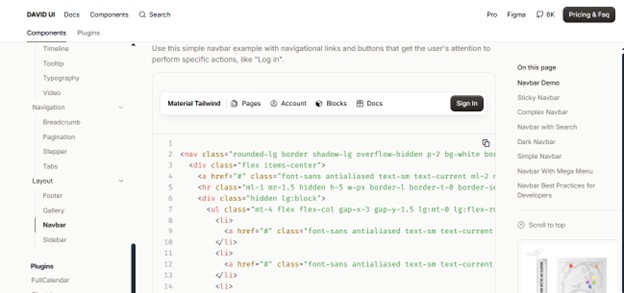
This kit includes a variety of pages and UI parts made with Tailwind CSS. The Tailwind Starter Kit gives you a bunch of pre-made pages and parts like navigation bars, headers, sections for features, team profiles, contact forms, and footers. These are all made with Tailwind CSS, which lets you put together the basic parts of your website quickly.
You can take what you need from the kit and change it however you like to fit your project. It’s a great tool for getting a head start on using Tailwind CSS for your web development projects.
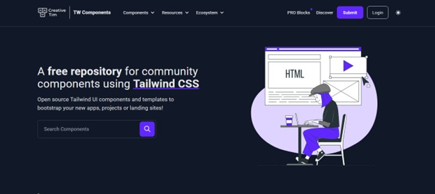
Tailwind Components
A place where you can find a lot of Tailwind CSS parts made by other
users, complete with code examples. Tailwind Components is a site where you can find lots of different parts made with Tailwind CSS, like cards, modals, dropdowns, and more. Each part has a live preview and the code you can copy to use in your own projects. You can look for specific parts or browse categories to find what you need. It’s a handy resource for finding examples and code snippets that can make building your site with Tailwind CSS easier.
Conclusion
Tailwind CSS is a really handy tool for making websites quickly, especially if you’re just starting out. It lets you style your site piece by piece without having to dive deep into writing lots of code. Plus, it’s designed to help your site look good on any device, which is super important these days.
Stay tuned to The Future Talk for more such interesting success stories. Comment your thoughts and join the conversation.